To develop a cohesive visual strategy that emphasizes the product's eco-friendliness and authenticity. To create a packaging design that stands out through a combination of minimalism and bold natural accents.
Veles is a synergy of ancient herbal traditions and modern cosmetology. We created a brand that doesn't just offer hair care but brings the consumer back to the roots, where nature is the primary source of beauty. The name, referencing the Slavic patron of nature, dictates a visual code filled with power, mysticism, and absolute purity.
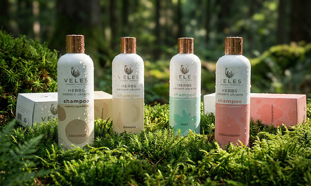
The main challenge was to combine the local identity of "Herbs of Western Ukraine" with exotic ingredients in a way that the brand felt cohesive. We developed a visual communication system where the wild nature of the Carpathians (the bear imagery, coniferous forests) meets tropical motifs. This emphasizes that Veles selects the best from around the world while preserving its Ukrainian soul.
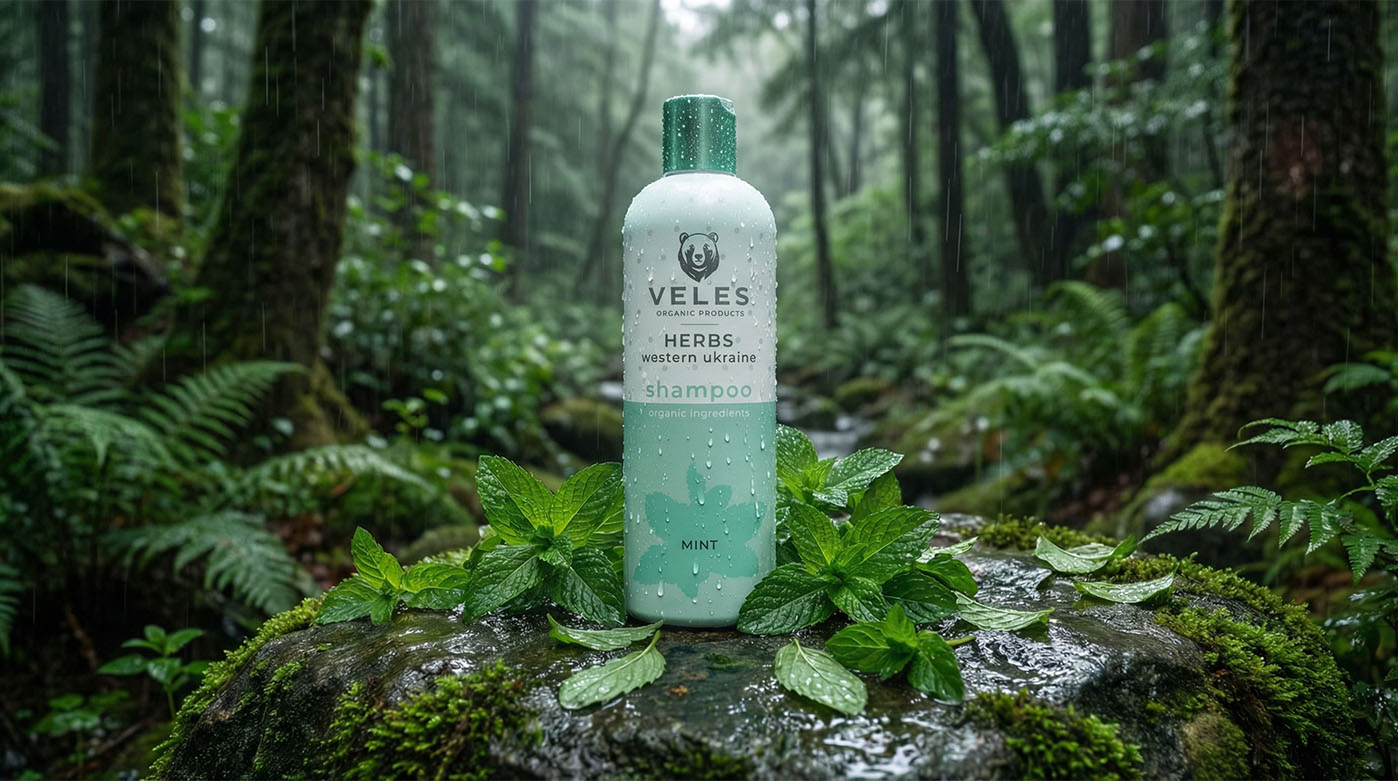
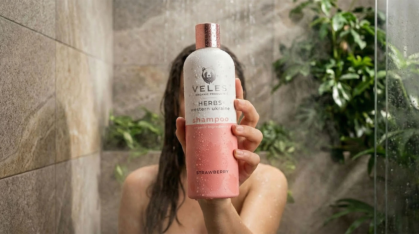
The project's visualization is a story of its own. We moved away from classic studio backgrounds in favor of hyper-realistic natural locations. Each bottle is integrated into its "native" environment: the mint shampoo stands amidst a rain-soaked forest, the coconut one in splashes of ocean water, and the banana variant in the shade of palm leaves. This approach creates an effect of presence, allowing the customer to feel the scent and freshness of the product even before the purchase. The packaging design, with its premium matte finish and gold elements, finalizes the image of a product that deserves a place in the world's finest hotels and spas.
The visual solution for Veles packaging is based on the principles of functional minimalism and the aesthetics of natural forms. We created a system where premium quality meets an eco-friendly subtext, using color and texture as the primary tools for communicating with the customer. The bottle design is crafted to appear as an organic addition to a modern interior.
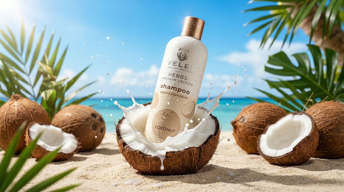
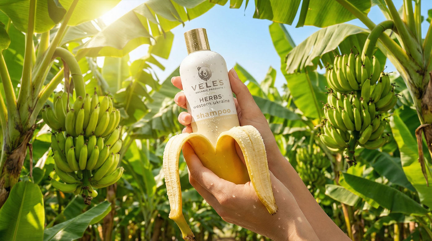
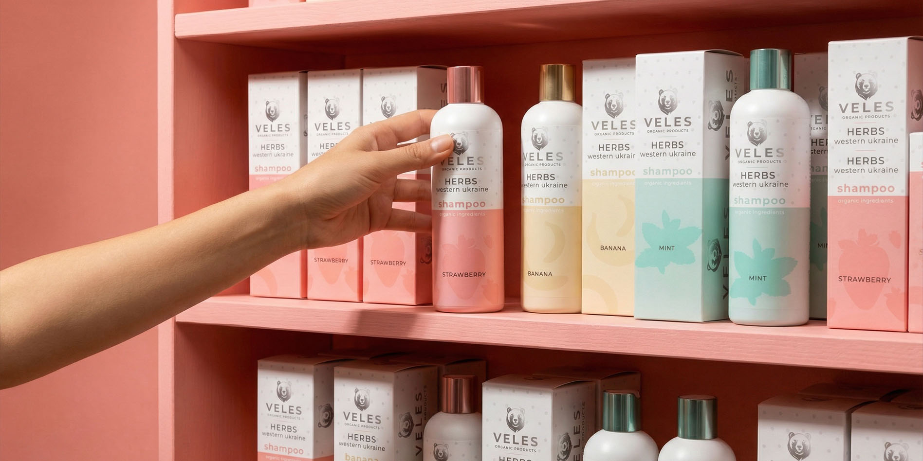
We focused on distinct color identification for each product line. Each scent has its own muted, natural shade: pastel pink for "Strawberry," soft yellow for "Banana," fresh aquamarine for "Mint," and milky white for "Coconut." The matte surface of the bottles provides pleasant tactile sensations (a "soft-touch" effect) and prevents slipping in hands, which is crucial for a product used in wet environments.
A special highlight is the metallic caps in shades of gold and rose gold. This adds a necessary premium shimmer and sets the product apart from mass-market competitors. The graphic labeling is executed in a clean, sans-serif font, emphasizing the purity of the ingredients and the high-tech manufacturing process. Semi-transparent illustrations of the key ingredients in the background add depth and visual lightness, making Veles packaging a benchmark of modern cosmetic design.